Paramount’s printed media guide serves to standardise and maintain consistent branding and messaging across all printed communications and materials. In collaboration with Studio Hansa and PS London, Barnwell Print have set brand compliance standards across all printed media.
The key purposes of a printed media style guide for brand consistency include:
- Establishing official logos, fonts, colors, and other visual branding elements along with rules and correct usage guidelines to create a unified visual identity.
- Providing tone, voice, and messaging standards and templates to ensure brand-appropriate language and messaging.
- Setting expectations and requirements for print communications content, design, and production through policies and specifications.
- Serving as an authoritative reference for internal teams and external partners on how to represent the brand accurately in any print format.
- Promoting awareness of the brand identity internally so all teams who produce print materials stay on-brand.
- Reducing errors and inconsistency across different prints that could dilute or misrepresent the brand image and message.
Overall the guide sets clear expectations for print, ensuring consistency and accuracy in portraying the brand to reinforce recognition and understanding of what the brand stands for. This leads to better alignment with branding and business goals across all printed communications.
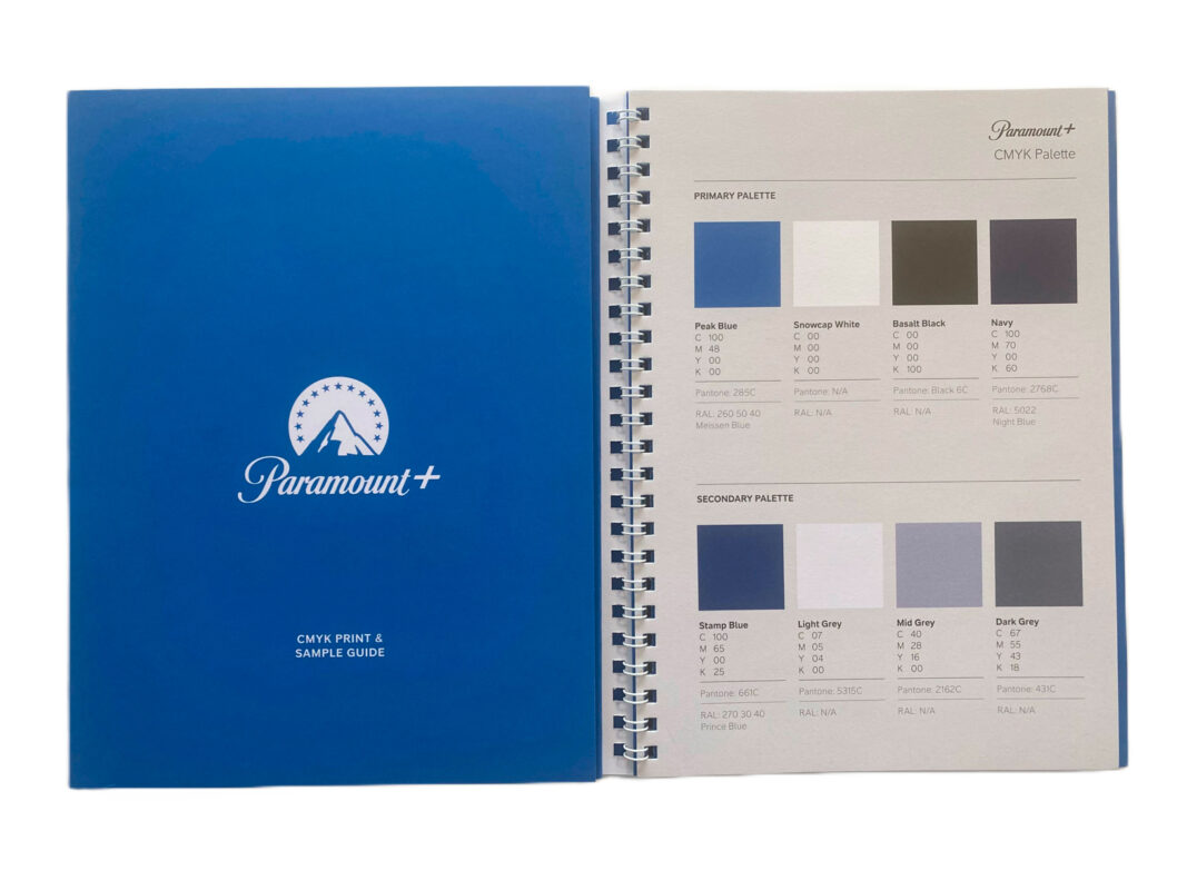
CMYK Print & Sample Guide
- Primary Palette
- Secondary Pallette
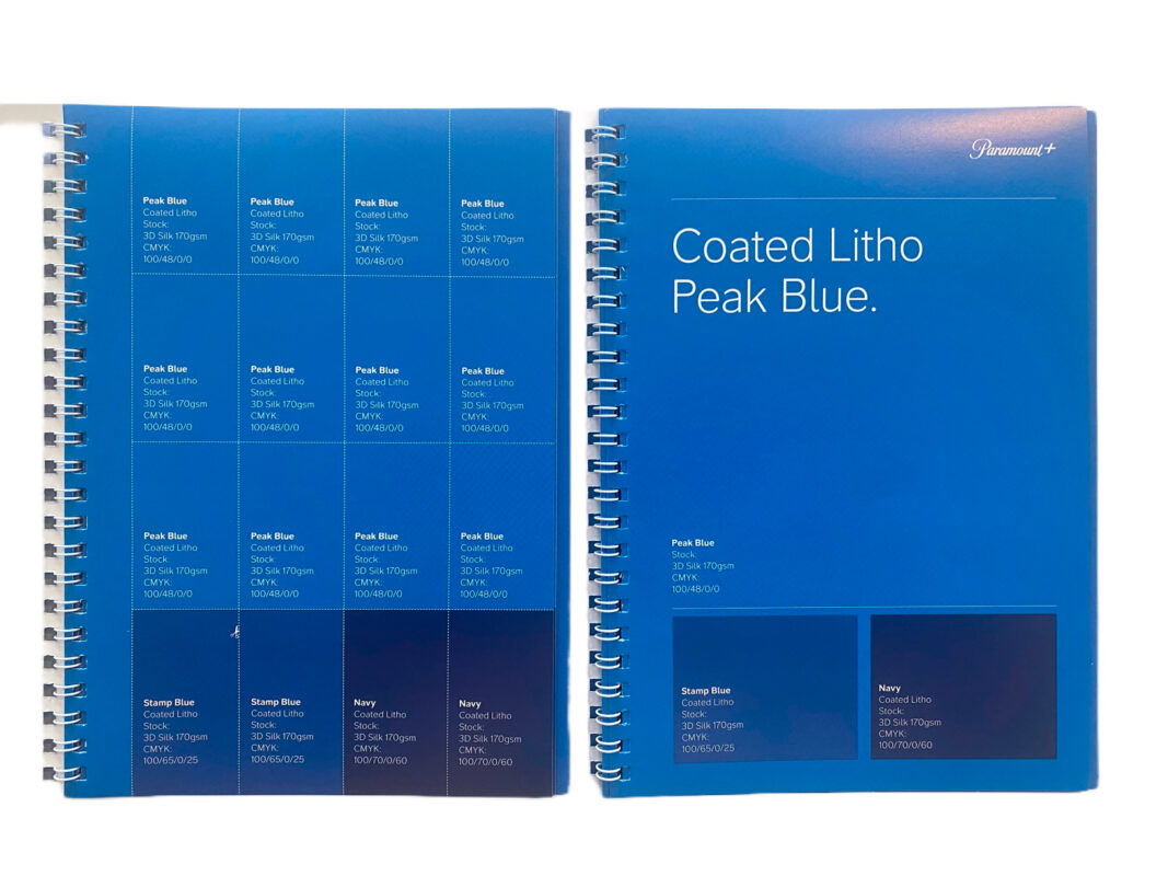
- Coated Litho Peak Blue
- Coated Digital Peak Blue
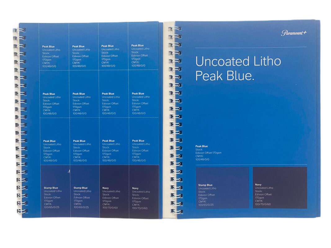
- Uncoated Litho Peak Blue
- Uncoated Digital Peak Blue
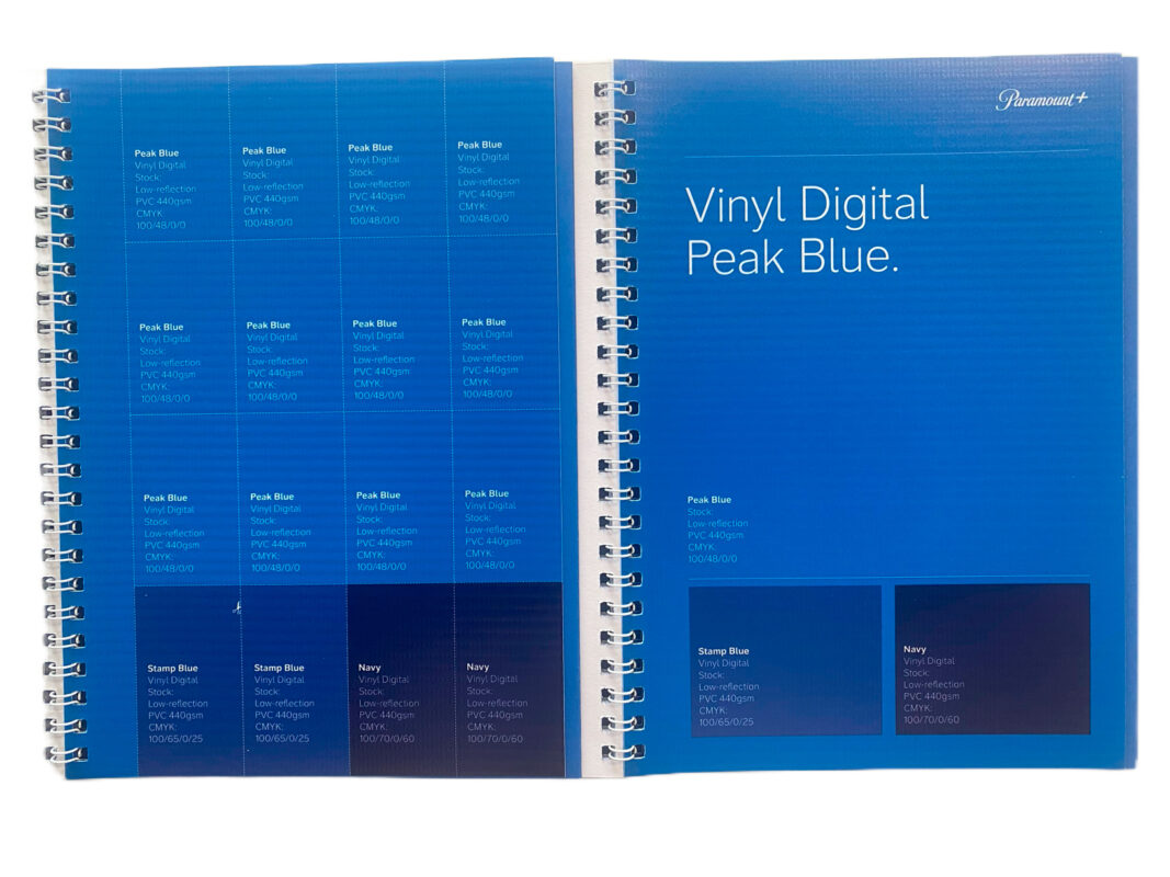
- Vinyl Digital Peak Blue
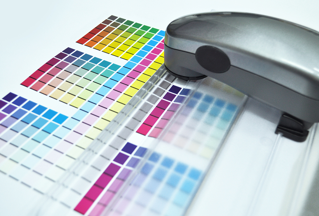
The key purpose of printed colour management is to ensure consistency, accuracy, and quality of colour reproduction across all printed materials representing a brand.
Our colour management aims to:
- Establish official brand colour palettes and set measurable standards for colour models, tints and shades so that the colours are reproducible within industry tolerances. This defines the brand’s visual identity with colour.
- Allow accurate communication of colour specifications to printers, designers and other third party production teams to ensure colours on final printed pieces match approved versions without perceptible shifts in hue, saturation etc.
- Reduce errors and undesirable variance between batches and print runs through calibrated workflows, profiling equipment and specifying standards. This tightens quality control.
- Optimise colour display across different print substrates, inks and printing processes through testing and providing appropriate profiles to account for variation and meet brand guidelines.
- Ensure brand colours are perceptually consistent to the human eye regardless of lighting conditions or printed material through carefully validated colour management procedures from design to print finish.
In summary, our printed colour management aims to limit deviation and maintain visual brand integrity across diverse production environments so that customers receive materials with brand colours that evoke the right aesthetic or emotional impact the brand intends to convey visually.